Colossal Cave (2023)
Sunday, January 29, 2023
Comments: 12 (latest July 9, 2024)
Tagged: reviews, ruminations, adventure, colossal cave, ken williams, roberta williams, will crowther, vr, if, don woods
A year ago, Ken and Roberta Williams boothed at GDC with a demo of their coming-out-of-retirement project: Colossal Cave in 3d. I wrote some thoughts at the time:
In a graphical environment, how do we render the confusing exits of Witt's End? How do we show that your inventory matters in the Tight Squeeze? Can you really not move around in the dark?
These are interesting questions! You can have fun thinking about them. I hope Roberta and Ken have had fun thinking about them. But I'd say that the best answers are going to point to a free adaptation of the game.
-- Roberta and Ken Williams are making a VR Colossal Cave, March 23, 2022
Now it's out, and I can say: this is a tight, nay, a pedantic adaptation of the original game.
(Warning: I assume you've long since played or at least read about the original game. So SPOILERS top to bottom, here on out.)
(By the way, when I say "the original" I mean the 350-point Fortran Adventure by Crowther and Woods. That's the ancestor of nearly every other version. If you're curious about the earliest history of Adventure / Colossal Cave, Dennis Jerz's 2007 article is definitive. And if you want to play the original -- not exactly the Fortran version, but close -- click here.)
Colossal Cave 2023 introduces itself by saying, in a reassuring British baritone: "Somewhere nearby is Colossal Cave, where others have found fortunes in treasure and gold..." Sends a wisp of mist down your spine, doesn't it?
It goes on to recite the rest of the original game's HELP text, only slightly updated for the graphical UI. (It says "Keep watch on your compass" instead of referring to parser commands like NORTH and SOUTH.)
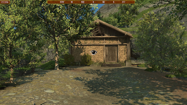
And then you are in a nicely-rendered forest by a small building. Click anywhere, and the game says: "You are standing at the end of a road before a small brick building. Around you is a forest. A small stream flows out of the building and down a gully."
 |
| A well-house for a large spring. |
The aim is clearly to include all the original text from Colossal Cave, as narration over a graphical environment. It even replicates the verbose/brief experience! If you click again in the opening location right away, it just says "You're at the end of the road again."
This is strangely comforting to me. But it's strange. It's like one of those Shakespeare adaptations that exactly follows the original text while transplanting the story to 90s California.
You can read the text if you want to follow along. So let's talk about the graphics instead.
 |
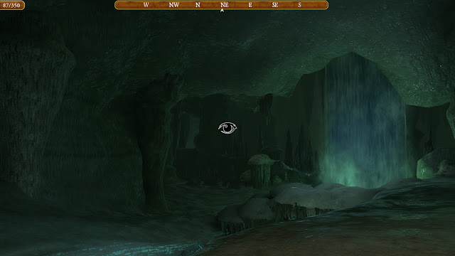
| You're in cavern with waterfall. |
This is, well, I'd call it "nice for an indie Unity game". That sounds dreadfully faint, I know. It is nice! Look at that flowstone! But it's not a 2020s-era visual wonderland, or even mid-2010s. The budget for environmental detail is rather tight -- no doubt to play on consumer-level VR sets. As a result, the outdoor environments are seriously shrunk down. The "lost in a forest" experience is reduced to a single clearing.
Once you get underground, ironically, the environment feels more expansive. The areas near the surface are cramped ("a low crawl...") and littered with tourist trash. But then the tunnels open into larger spaces, with dark abysses above or below, and you really start to feel like an explorer in a vast and mysterious space.
(I didn't play in VR, in case you were wondering. As I've written before, VR doesn't do a lot for me. Old-fashioned mouse-and-screen games are as just immersive for me as headsets, so I don't bother.)
 |
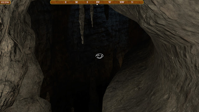
| You are in an awkward sloping east-west canyon. |
The original text is preserved, but the creators haven't hesitated to add more detail. They've tried to make the caverns into a more consistent environment. Large stretches are reimagined as a dwarvish mine. You can spot dwarves mining gold nuggets and sparkling diamonds -- or reading a magazine -- in the appropriate spots. (These "scenery" dwarves always flee your presence without interacting.)
I'm somewhat ambivalent about these changes. It's disconcerting to come across a sturdy ladder leading up or down, when I know perfectly well that Crowther's vision was squirmy limestone chimneys. Similarly, the Hall of the Mountain King is a crumbling subterranean palace rather than a natural cavern enlivened by a fanciful nickname. The different-maze isn't caves at all, but a set of steel-walled bunkers. (No doubt to fit thematically with the vending machine found within.)
Occasionally these changes clash with the gameplay. The dwarven areas are detailed with clip-on electric lights; other caves have fanciful glowing crystals or fungi. But let your lamp go out and you'll find that these are purely decorative. If the original game says an area is dark, it's gotta be dark.
Lighting quirks aside, I can't argue with a more cohesive environment. And if I prefer the natural cave areas to the constructed ones, well, more fool me. The "Cave Under Construction" zone slyly hints that the entire underworld is dwarven craftsmanship. (Remember Old Gods Rising?)
(Another sly joke: the bunkers of the different-maze are visually all alike. You have to click to hear the "different" textual descriptions. Whereas in the alike-maze, you can see the exits and which way they twist -- so those rooms are visually all different! Now that's smart adaptation of the original design.)
If you want a bit of commentary on the game's visual design, check out this ArtStation page from Jayson Bennett and this set from Morgan Hamilton. I was particularly tickled by the Main Office, which includes the very PDP-10 that the game is running on.
The magic of the Adventure parser is that, once you know the basics of IF-ese, you can type anything you can think of to try. (Or at least you can convince yourself so!) Can we bring this freedom of action to a graphical point-and-click game?
It turns out that you can! For Colossal Cave, anyhow. Here's a complete list of the game's UI actions:
- Move around with WASD/mouse. (No jumping.)
- Click on anything to examine it.
- Alt-click on a portable object to pick it up.
- Alt-click on a scenery object to do the "obvious" contextual action with your bare hands. (
OPEN DOOR,CLIMB LADDER, etc.) (Yes, your bare hands, you're way ahead of me.) - In your inventory, you can select an item and get three options:
-
DROP ITEM.
-
- Some contextual action appropriate to the item (
LIGHT LAMP,EAT FOOD,EMPTY BOTTLE).
- Some contextual action appropriate to the item (
-
USEthe item on something in the world around you (again, with the appropriate contextual action).
- The inventory has a sidebar of magic words you've learned; select one to
SAYit.
This isn't Myst's one-button UI, but it's well within the bounds of graphical adventure convention. And it's enough to completely implement Colossal Cave.
I don't think this is a universal solution for adapting parser games. It would have trouble with any scene where there are several possible contextual verbs. (Imagine a movable crate that you could PUSH or PULL, for example. Or the difference between GIVE AXE TO TROLL and KILL TROLL WITH AXE.) But Colossal Cave happens not to have any of those!
Of course USE X ON Y covers a lot of sins, but in most cases it feels natural. You want to unlock the grate: select the keys, hit USE, click them on the grate. Catching the little bird in the cage: same thing really. Giving a treasure to the troll? You get the idea.
It only gets awkward in scenes where the original game was awkward. UNLEASH BIRD ON SNAKE isn't exactly clued anywhere, but if you have the idea it's clear how to do it. Probably the worst offense is WAVE ROD AT FISSURE, which I don't see how anybody would think of -- either in the original game or this one -- without being part of an Internet forum ARG-ing on solutions. Which, of course, the original game had.
Mind you, the fissure bridge is an optional puzzle -- you can bypass it by way of the Hall of the Mountain King! So in some sense, a moon-logic solution is appropriate. But it's still a clunky piece of design.
Some other awkward design choices:
The cave has lots of art greeblies, from bits of paper to dwarf shovels to inexplicable trash cans. I mentioned the decorative lights, too. None of this stuff does anything, but if you haven't memorized the original game, it's hard to know what to ignore without clicking everywhere. (Portable objects are highlighted, which is good, but that doesn't help with all the scenery.)
There's even stuff like a non-functional rowboat on the underground reservoir. If you try to use it, the game says "That isn't your boat," which is a brazen assertion given how much stolen treasure you're toting around.
Some events (like hearing PLUGH spoken) have a chance of triggering when you enter a room. This is consistent with the original game, but since "rooms" are now arbitrary demarcations of 3D space, you sometimes have to dance back and forth through a doorway to trigger them.
(Is the lamp juice also measured in actions and room transitions? I bet it is. I tend to sprint around the cave to save time, but it's probably bootless.)
Narration means canonical pronounciations of XYZZY and PLUGH. I disapprove on principle. (The game says "zizzy" but I've always spelled it out, and don't tell me I'm wrong.)
On the up side, the mirror window gag works better in graphical form. You see a gesticulating figure matching your position! They're right there! On the down side, the mirror window gag never served any game purpose, so why all the effort? (In Graham Nelson's Inform port, you could distract a dwarf from chasing you by running past the mirror, but I think that was an addition.)
Okay, yes, the dwarves. And other annoyances.
The great flaw of replicating a 1970s game is all the design decisions which people had gotten throughly sick of by, say, the 1990s. Like a lamp that runs out of juice while you're still exploring. Or dwarves that appear and fling cutlery at you with no way to dodge.
I don't know whether Colossal Cave uses the same dwarf logic as the original text game. I'm going to presume it does. That's a 9.5% chance of death every time a dwarf appears, with some tweaks.
(The very first time a dwarf attacks you it will always miss. If they get mad, their aim improves. There are five dwarves following you around; several of them can attack you at the same time, which is bad. It's possible to kill them all off, which is good. The various ports and adaptations of Colossal Cave may follow these principles closely, loosely, or not at all.)
In modern adventure terms, or honestly even in 1990s adventure terms, a monster surprise-killing you is an absolute buzzkill. The first time Colossal Cave did that, I stopped playing for several days -- the thought of it happening again was just exhausting.
(Most modern text ports of Colossal Cave support UNDO, which makes this a bit more bearable. Sadly, not here.)
Oh, the pirate happens too. He appears and steals all your treasures and hides them in his maze. This isn't entirely terrible. It's a handy way to bypass your inventory limit and cache treasures within striking distance of the exit. Except for the treasures which are also puzzle solutions! Having those stolen can wreck your run! Argh.
Oh yes, the inventory limit. Did we mention the inventory limit?
None of this is unmanageable if you save every few rooms, keep all your save files, and replay every part of the game several times to optimize your run. The game is happy to let you do this. It even retains your map when you restart or reload a game, which is of course how we all played back when maps were scribbled on scrap paper. But the idea that you should play this way will be very strange to anyone under forty.
I feel like the game needs footnotes everywhere. "Yeah, your lamp will die soon. This seemed like a good idea in 1977. Sorry!" Although, I should note, there's an "easy mode" for the lamp. If you read the instructions at the beginning (which costs ten points) you get your lamp lifetime doubled for free! Now, how about a "no dwarves no pirate" option for another ten points? Eh?
As it is, I still haven't mustered the energy to finish the new Colossal Cave. I've mapped nearly all of the rooms and most of the treasures. I've seen the magnificent cavern and the breath-taking view. (I have not yet brought light to the dark room.) But the prospect of paperworking my way to 350 points, with a treasure checklist and an indexed spreadsheet of save files, is -- again -- exhausting. I don't think it's gonna happen.
So who, in this end, is this game for? Why write such a thing?
One perfectly good answer is "Roberta Williams got a wild hair and decided it would be fun." I will never say a bad word about such projects. That's how most IF is made these days!
Same goes for "This seems impossible and Williams wanted to prove it could be done." Rock on.
Another answer is "People want to experience a classic cave game in VR." I admit I'm willing to say a bad word about VR. As I noted, the graphics are scaled for Quest 2, which makes for a weak experience compared to even a modest indie PC game. But I guess people who are drooling for VR will be into it.
(In these situations, I always wonder if Facebook chartered the whole project as a loss leader for Quest. Pretty sure that's what happened with Myst, for example. But according to at least one interview, no -- VR was the CC team's own idea.)
Yet another possible reason to make this game is "Bring original Adventure to a new generation." Here I start to get skeptical. The new generation is going to be annoyed by this game -- just like I was. There are so many design infelicities which could be cleaned up. Not just the dwarves! There's dead ends. There's non-deterministic exits. There's wild swerves of design theme and mismatched chunks of terrain. There's an absolute refusal to ask "what is that doing there?" There's a total lack of systematic puzzle elements to master.
That's why I started out talking about a "free adaptation". Sticking to the exact original text is clearly a goal, but so few people will appreciate it. Perhaps just me! A game like this could attract a wider indie audience... but I suspect this game won't.
Only that's a downer, and I refuse to end this review on a downer.
Colossal Cave is a heck of an idea, and it does what it does almost impeccably. It's got miles of atmospheric cavern to wander through. It's a fully playable graphical game (once you embrace the map-and-save-file mindset) which recreates the entire intent of the parser original. It's got the dragon.
I didn't think this game would work, and it works. Rock on.
Comments imported from Blogger
Comments from Mastodon
Huh. The graphical (Roberta Williams) Colossal Cave now has a no-dwarves-no-pirates option. (I suggested this in my original review; I’m sure I wasn’t the first or twentieth person to do so.)
This is a significant shift for the designers, who made a point of sticking exactly to the original game’s mechanics. I believe their only other difficulty concession is optionally doubling the lamp life.
I really wonder what kind of traction this thing is getting. (Compared to, e.g., Riven.)
@zarfeblong I can't imagine the tail on sales is super long but they keep working on it so who knows. Glad they did it though I don't know how many people are going to go back who originally bounced off it
I also agree that the lamp light is probably the other thing that new players probably had difficulty on and should probably be extended in the Explorer mode too
@zarfeblong Riven already has 21x the steam reviews... I suspect CC has not been selling very well. Still, I do admire when people continue to update a game despite that.

