
Good luck, everybody
Friday, July 24, 2026
Tagged: if, interactive fiction, the witness, infocom, luck, chinese, restaurants, matchbooks
I'm embarrassed about this one.
The Witness will be September's release for the Visible Zorker project, but it's already done for Patreon supporters. So I've scanned my Witness feelies for the app already. (You can see the high-res scans here at the Internet Archive.) It's a classic package. The 1938 newspaper is probably Infocom's high point for pure immersive scene-setting.
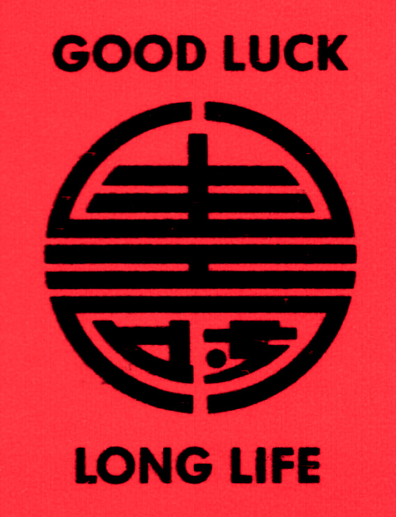
But the matchbook caught my attention.
 My original matchbook feelie from The Witness.
That's a curious symbol. It's sort of a generic "look at this Chinese symbol" symbol. But is it actually Chinese? The Witness has this uncomfortable schtick of "obviously Asian, but no definite nationality". The Linder house is full of Orientalist tat; some of it is Japanese style, but only the "small Shinto shrine" in the entry betrays an actual tradition.
 If you know Chinese: just hold off. I'll get there.
So I immediately suspected that the symbol is a fake. After all, everything else on the matchbook is some variety of joke. "Brass Lantern", come on. The street names are Joel Berez and Al Vezza, two Infocom execs. The phone number "Chandler-1729" refers not only to Raymond Chandler, but to the best-known anecdote about the mathematical prodigy Ramanujan.
I did a quick image search to try to verify (or disprove) my theory. There are certainly a lot of symbols like that one:
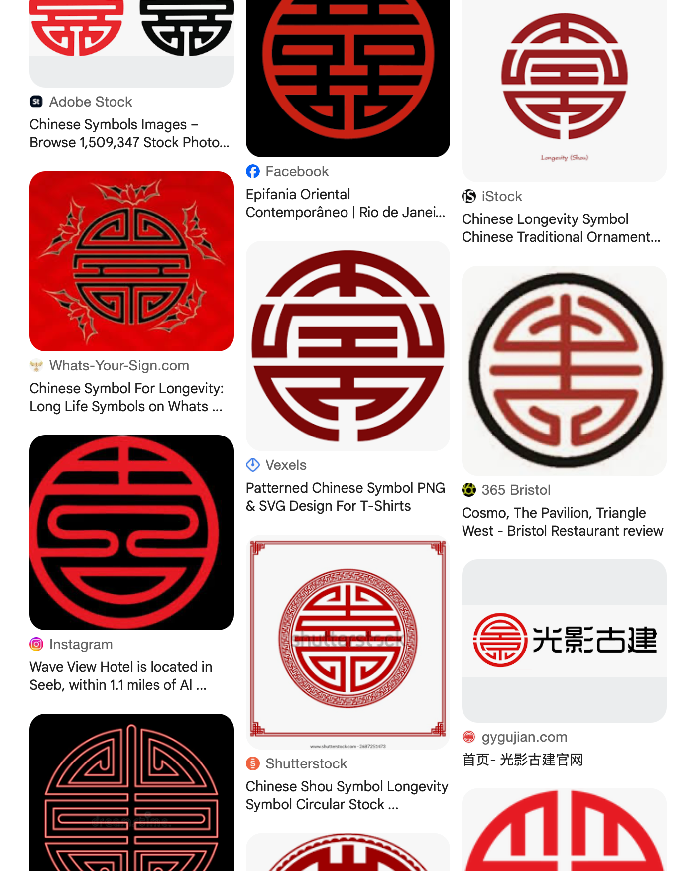
But they all seem to be bilaterally symmetric, or nearly so. None of them have those squiggly bottom inserts.
Well, what about those inserts? They look awfully suspicious, especially upside down:
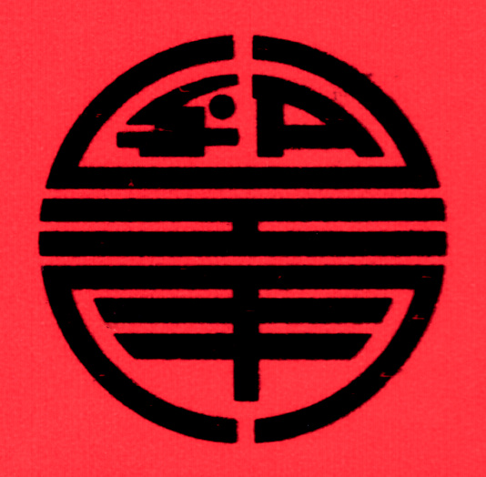
Surely the right side is the Latin letter A. The left side is less obvious, but maybe an S? Or an E, or... this isn't really coming together. If it were SG, for "Stu Galley", then I'd buy it; but I can't make that work.
Maybe more context would help. Infocom's delightful packages were designed by G/R Copy, aka Giardini/Russell, aka the demon Jeearr. Did they have an "SA" on staff? ...How would I know?
At this point I started asking around, hoping someone would be smarter than me.
You know what happened next. Someone replied that it was an actual Chinese symbol. The character 壽 (shòu) really does mean "long life". I was barking up the wrong tree entirely.
(Two people, in fact. Thank to David Goldfarb and BoysenberryCider.)
壽
If your browser doesn't render that Unicode character, here's a image version, with serifs:
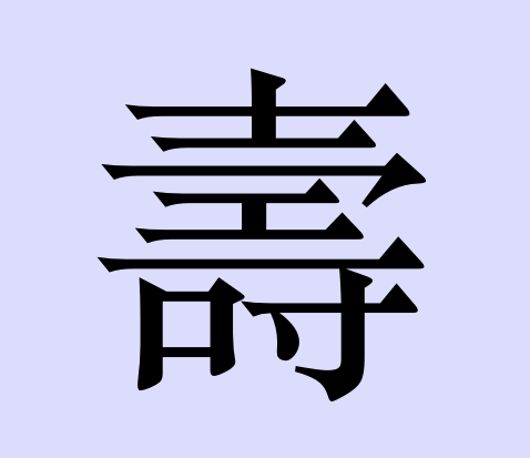
(Apparently there's a Unicode character specifically for the rounded version, but I don't have a font that displays it.)
Wikipedia has a whole page of examples of shòu used in art. And guess what? Nearly all of them are bilaterally symmetrical!
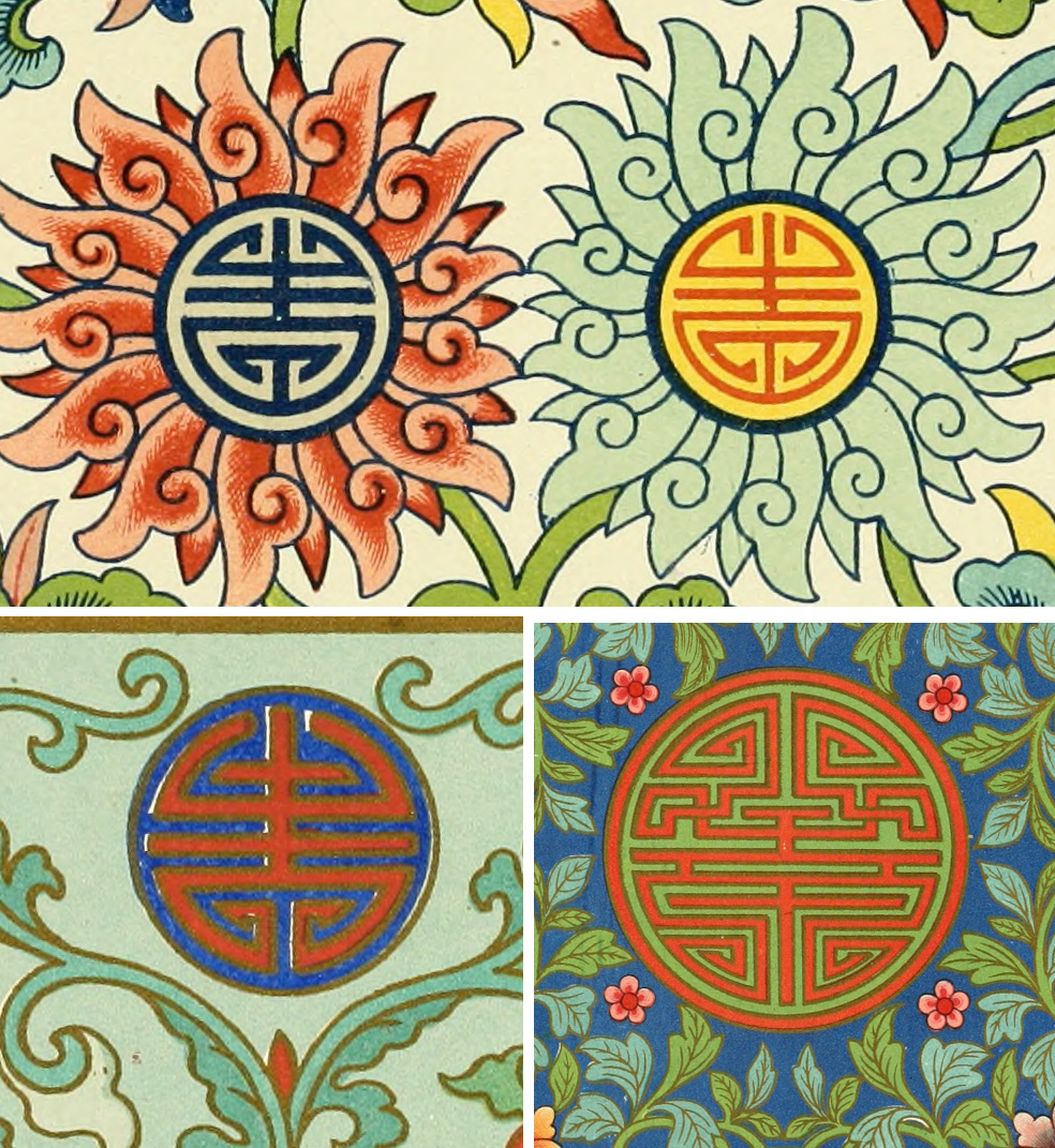 From Examples of Chinese Ornament, Owen Jones, 1867.
Except for the ones that just go to town...
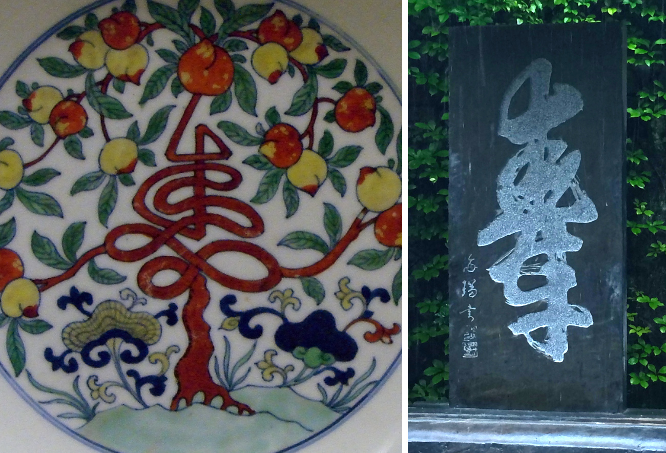 A peach-tree shòu and one by Hai Rui which, at least according to the caption, is an ambigram.
I would be hard pressed to describe these symbols as having anything in common, beyond "a lot of horizontal lines around a vertical axis". Which just goes to show that I'm not looking at them right. This is decorative lettering (ideographing?). It's meant to convey the basic idea to someone who's familiar with the symbol. Someone who's already seen it zillions of times in different decorative forms already.
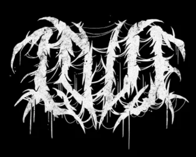 Someone must have done shòu in heavy-metal, but I couldn't find it, so here's LOVE instead.
For laughs, I spent some time trawling Ebay for "vintage Chinese matchbooks". Quite a few listings, but none in the style of the Witness one. One did have the shòu character:
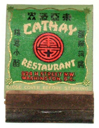 This photo indicates that the Cathay Restaurant was open from 1941 to 1966.
Of course, the designers at G/R didn't have Ebay to trawl. They must have had some design source but I have no idea what. Not that 1867 Chinese Ornament book, certainly.
Arguably they fell into a trap of making the Chinese character look too much like itself. They should have gone for decorative rather than readable! Live and learn.