Making navigation work
Tuesday, May 9, 2017
Comments: 2 (latest 3 hours later)
Tagged: hadean lands, navigation, maps, design, interactive fiction, vignettes, seltani, frostrune, if, myst, submachine
I've been playing a bunch of mobile games this spring (for no reason except that I played a lot of PC games over the winter) and I keep thinking about navigation.
Here's a navigation scheme which is common in casual first-person adventures: you always face forward. In every room, there's some number of exits, plus one invisible exit behind you. So you can go forward in various directions (unless you're at a dead end), and you can go back (unless you're at the start). If you bang the "back" button enough times you'll always return to the start room.
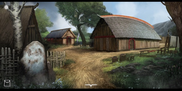
I don't know if this scheme has a common name; I'll call it forward-and-back. Examples that I've played recently: The Frostrune, Agent A, Facility 47.
(I'm distinguishing forward-and-back from the common scheme of third-person adventures, where the room contains several exits but they're all visible and the character avatar walks from one to another. That's different; it has no sense of "forward" or "back", although it may have a sense of "left and right".)
Forward-and-back has some obvious advantages. The player always has the same orientation in every room, so the game only needs one image of each room. (Important for a low-budget game where the backgrounds are hand-illustrated rather than rendered from a 3D model.) If the player gets lost, they can smack "back" button until they're not.
The scheme doesn't really support complex 3D environments, or puzzles based on 3D environments. You can't move your viewpoint around to understand 3D relations within a room, and 3D relations between rooms are usually obscure. (The "forward" direction is usually different from one room to the next!) So the scheme has limitations, but okay, every scheme has limitations.
But after playing a bunch of forward-and-back games, I have a complaint. I always feel lost. Or, no, "lost" is wrong. I always know where I am. I have a mental map (a tree, of course). I usually remember what's behind me and what rooms are ahead. But moving around is a somewhat laborious process. These games always involve lots of running back and forth, and the running around takes effort; it doesn't feel automatic.
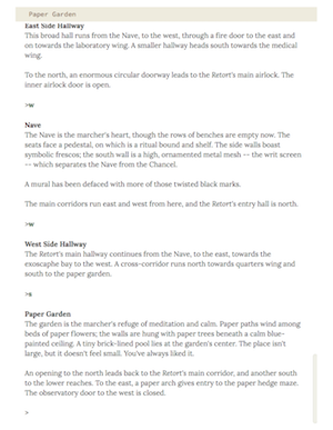
Compare this to the parser IF navigation scheme. IF compass directions take a lot of crap ("artificial", "unintuitive" -- here's the most recent of many threads on the subject). But, by dooley, if I want to get across Hadean Lands I type
"N <enter> N <enter> W <enter> W <enter> W <enter> W <enter> S <enter>" faster than I can think. (Even in a game like HL which supports "GO TO GARDEN", I usually use the compass directions.) Thus, when I'm working on a puzzle, I'm always working on the puzzle. Even if I have to run around, I have no sense of being interrupted by the busy-work of navigation.
What's the difference? Why do six clicks in a graphical adventure feel like more work than six keyboard inputs in a text adventure?
My current theory (certainly overgeneralized): the forward-and-back scheme doesn't give you enough context to think about long journeys.
For the journeys in HL (and other parser IF), I plot out the entire course before I start typing. I enter the commands without reading the responses, or reading just enough to verify that I'm on the right track. (An unexpectedly locked door will stop me, but I might overrun by a few commands before my fingers stop.) But in the forward-and-back games, I can't do this. I enter a room, look around, pick out the right door, click it, and repeat. I can't click-click-click across the game world.
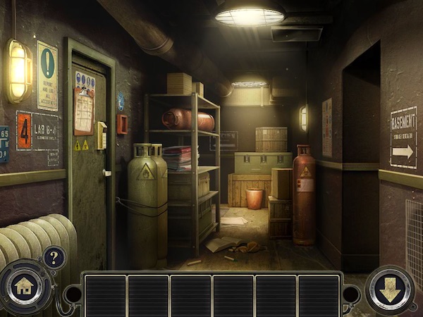
Of course the game designers want to give me context. They post signs; they make buildings visible in the distance. But this is rarely consistent, and it usually only signposts the next room -- not the destination of my journey. If I'm standing at a fork in the road, I have to visualize the world map, think about the next room, and then remember what the path to it looks like. That's the extra step.
Okay, that's a hypothesis. Let's test it against some other game schemas.
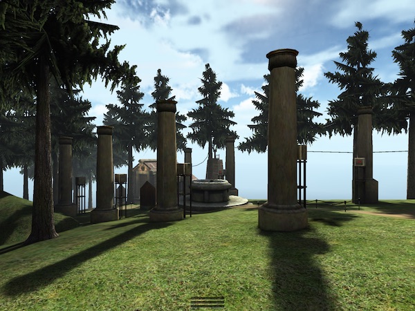
In the classical first-person adventure, all movement is "forwards", because you can turn around within a room. The original Myst had clunky slide-show turns, but the genre soon upgraded to 360-panning views (Myst 3) and then to fully 3D worlds.
Now, running around these adventure games is never trivial. There's always a lot of clicking (or holding the "run" button). It can take time. But it doesn't require much thinking, because (once you've learned the map!) you just orient yourself and go. The game gives you the context to look around, to build the entire world map in your head. You see the fountain across the lawn, but you recall that the clock tower is visible down the fountain path, so it's ahead and on the left, so... and the next several steps are clear.
(I am, of course, speaking from the privilege of my own head! I have excellent spatial perception and visualization skills. So this whole analysis may be bunk to you, but I have to work this out for myself first...)
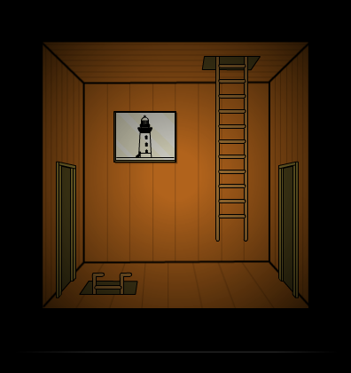
Here's Submachine 1. This is a first-person view, but most of the navigation is up-down-left-right rather than forward-and-back. The world falls into a regular grid (or a few regular grids joined by "ahead" doors). Result: easy navigation! I can click-click-click around the world.
(Then the author makes the later Submachine games really big -- scores of rooms -- which makes the navigation harder again. But at least the difficulty buys me more game.)
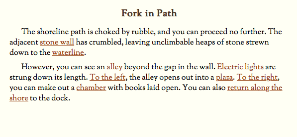
In Seltani, my hypertext MMO/MUD, I struggled to make Myst-like physical environments accessible in text. It almost worked -- but traversing large Ages is laborious, even for me. Even the worlds I created! I enter a room, look around, pick the right hyperlink...
Isn't this where we came in? Navigating in Seltani feels exactly like navigating a forward-and-back graphical game -- at least to me. I can learn an area well enough to click the links faster, but it never gets fast; I can never click-click-click through the world. And I think the problem is the same: not enough context, no way to visualize the entire space. It's the feeling of trying to cook dinner without my glasses.
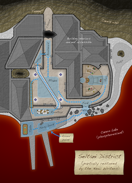
Here's a map of the area described above. Better, right? If I ever redo Seltani, I'll add clickable maps to all my Ages.
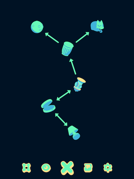
Finally, an odd case. Vignettes is a puzzle game with no physical space at all. You "explore" by transforming objects using Escherian perspective tricks.
I played a bit. Then I put the game down and said "Nice concept, but the navigation is terrible!" Is there navigation? Well, there's a map, as we see above. The map shows known, nearby transformations: from the fire hydrant, we can reach the trashcan and the pillcase.
But again: not enough context. The game challenges us to find every transformation, but the map never shows us the whole world -- not even the known world. Missing links are shown as question marks, but only the nearby ones. If the local zone is complete (as above), how do we run across the world to a new one? The map gives us no help. It's not even a clickable map; we have to redo every transformation to explore, even the known ones.
(Added frustration: one-way links. If you're trying to move across the map, you can fall down a chute and land back where you started.) (And even more: the chest metaphor lets you jump instantly across the world, but only to a region that you've completely mined out! It's useless for reaching incomplete regions, the ones you need to reach to finish the game.)
(For all this complaining, I did pick Vignettes back up and finish it. The map is small enough to be playable despite its faults. But I nearly had to draw a paper map to finish -- the unforgivable sin of a mobile game.)
So what qualities make a game truly navigable? I say:
- the game must let you understand the entire shape of the world;
- the game must let you apply that knowledge to move across chunks of the world without stopping to think.
There are plenty of strategies for each point. A large-scale map with "click here to jump" buttons will always solve the problem, but it's not the only possibility. The designer may not want jumping; they may want to preserve the experience of continuous movement. Or they may not have the resources to implement the jump button. (At worst, it can require implementing all your lock-and-puzzle logic twice, which is a minefield of potential game bugs. Ask me about Hadean Lands...)
A large-scale map without interactivity will help if the player can connect map features to game-world features. (This is where my Seltani district map falls short; map symbols don't match up well to text.)
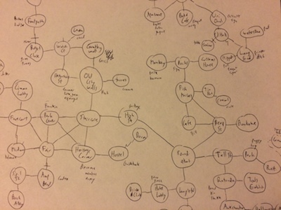
(A player who draws a map is certain to understand the shape of the world! But asking the player to draw a map is pretty much unjustifiable if the game has any graphical capability at all. Grumble at these modern times or embrace them, as you like, but that's where we are.)
In a graphical environment, being able to see from one area to another is good; being able to look around and see the world from many angles is also good. Both together give the player a great deal of context. Regular grids, top-down views, and consistent viewing angles all help the player make sense of the world.
And finally, all these concerns apply even to completely abstract maps which have nothing to do with physical space. A limited horizon and inconsistent directions will leave a player feeling lost, even in a skill tree or a branching plot diagram.
Comments imported from Gameshelf
Oreolek
(May 9, 2017 at 1:27 PM):
I love "speedwalk" feature in MUD clients where you type "nnws" and the client types "north

I always have to "draw" maps in IF games that don't provide maps, though these days I usually do it in note-taking software with hierarchical bullets, making a tree of rooms. Maps are not trees, but when there are cycles I just make a note, naming the destination room. It also provides a convenient structure to write out notes about objects, NPCs, and other puzzles I find in the rooms.