

The serif on the N
Wednesday, January 24, 2024
Comments: 17 (latest 3 days later)
Tagged: interactive fiction, if, infocom, graphic design, logos
This is unquestionably the fussiest, least interesting blog post I will ever make about Infocom. Buckle up.
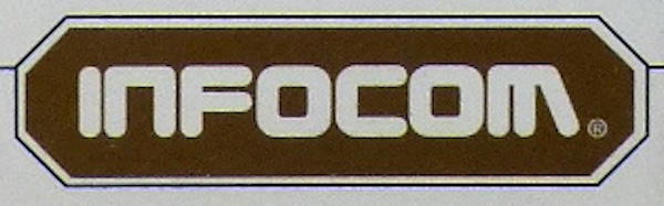
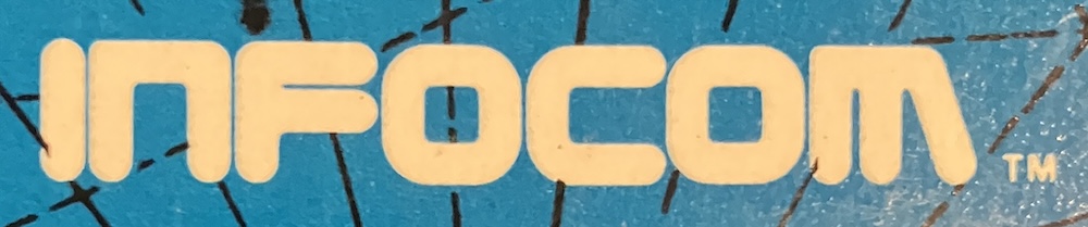
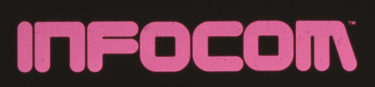 Infocom logo circa 1985. Courtesy of the MIT Museum and Mike Dornbrook.
Everybody knows this logo. I say "everyone"; of course I mean "a small cohort of middle-aged nerds." If you know you know; if not, pretend for a while.
It's highly recognizable. It's sans-serif. It's also kind of hinky. The letters are spaced so tightly that they bleed together. The gap in the F doesn't match the gap in the M. If you look really close, the O's don't line up.
This isn't terribly surprising. This logo was designed around 1980. It was probably drawn on a big piece of paper with drafting tools and then photographed. Was it graph paper? We'll never know.
Here, by the way, is a collection of earlier logo prototypes that Infocom considered. Clearly they were very keen on that i:
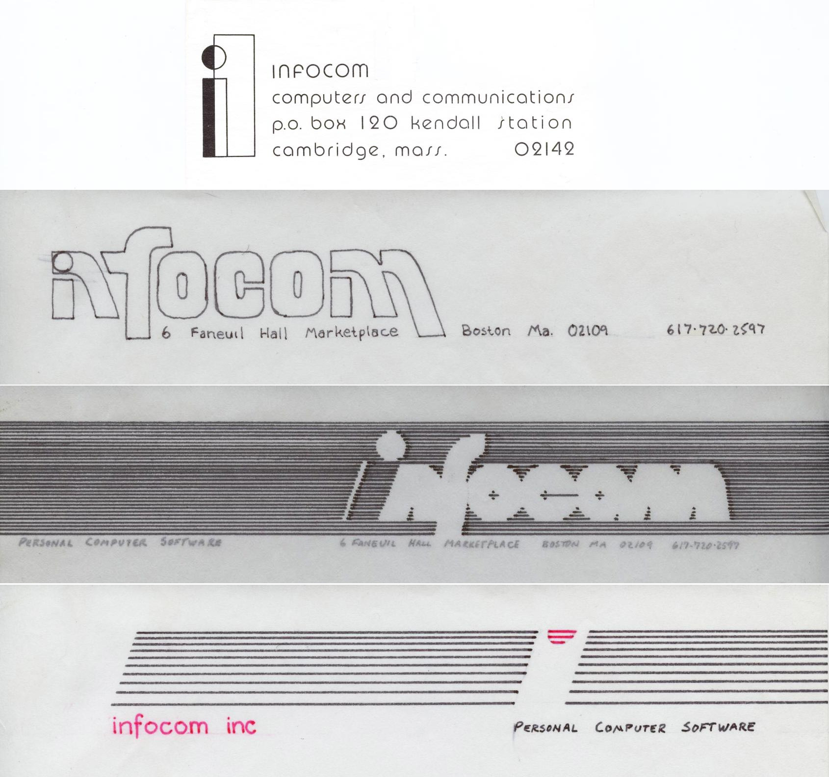 From the Infocom Cabinet collection at the Internet Archive, courtesy of Steve Meretzky and Jason Scott. Thanks to Doteaters for the link.
That top one was used in 1979, before the company even had an office. It didn't last very long. When Zork was initially published by Personal Software, Infocom had no logo at all:
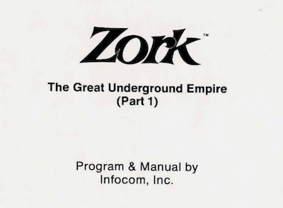 The only mention of Infocom in the famous "Barbarian Zork" manual.
In 1981, the company took over its own publishing. Zork got the dungeon-door treatment -- not to mention a numeral -- and Infocom got its for-real branding.
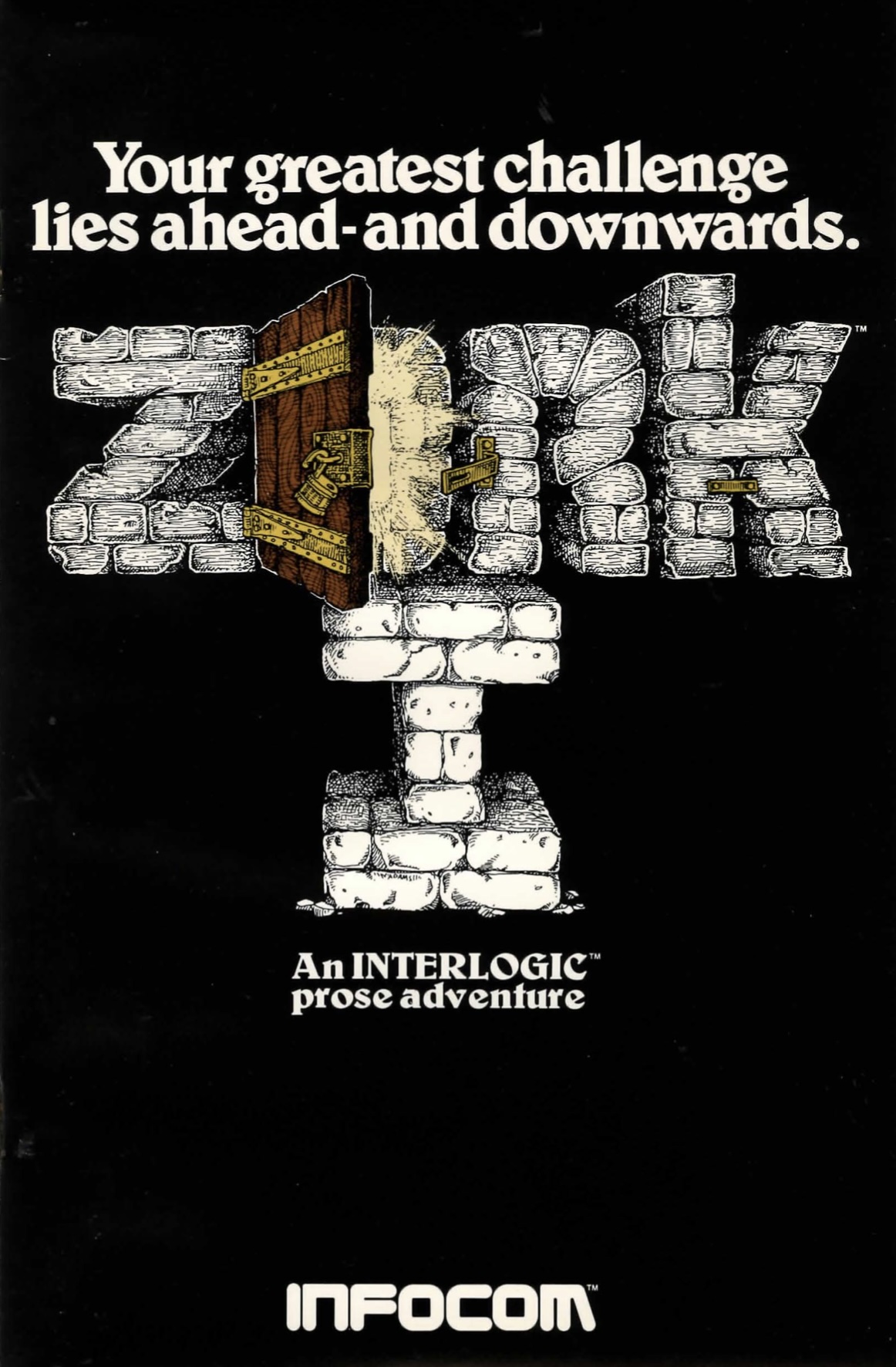 Cover of the Zork 1 folio edition. Courtesy of MOCAGH.
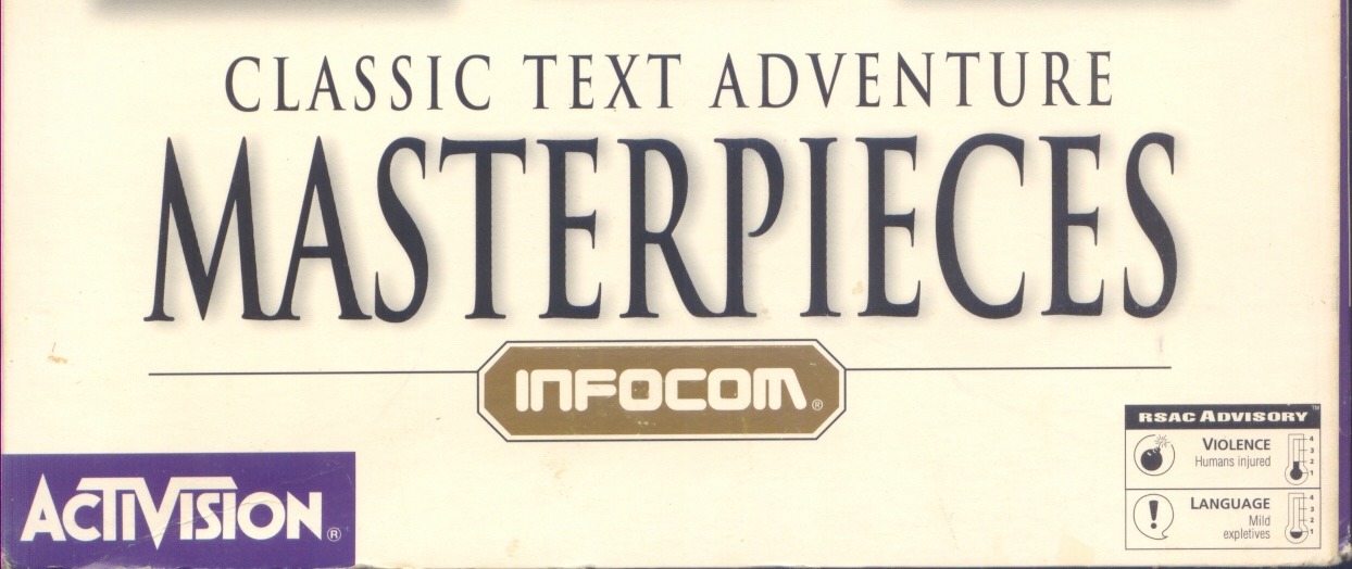
And there it stayed, all the way through the Masterpieces CD in 1996...
 Courtesy of Archive.org.
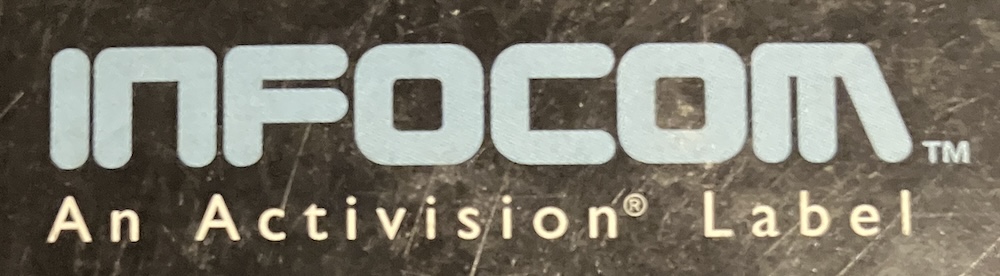
...wait, what's that? Enhance!
Someone redrew it. The M is at a different angle. The F-gap is wider. The counters inside the letters are square rather than rounded -- except the O's, which are inconsistent.
And the N has lost its serif! I mean, it didn't have a serif, but the original logo had pointier corners on the N and M. Sort of a serif abstraction. This new logo has a perfectly symmetrical N.
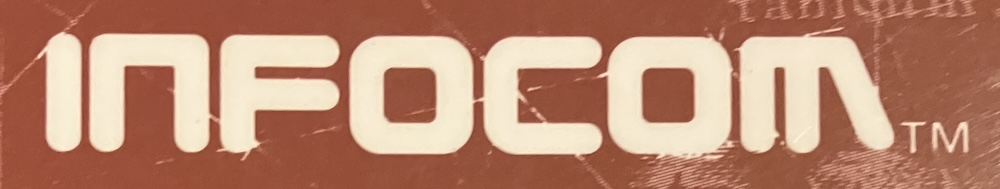
Here's the Zork Anthology manual (1994), which I still have on my shelf:
The earlier Lost Treasures of Infocom 2 collection (1992) also has the wrong logo, and at a slightly lighter weight, to boot:
But, curiously, the first Lost Treasures of Infocom (1991) does not! So that's the breakpoint. 1992: the year the N went wrong.
I could hold forth as a design snob and declare that the new logo has lost the original's ineffable charm. I'd be kidding myself, though. I've had these manuals for thirty years and never noticed the switch. (And because I've had them for thirty years, I have to take off my glasses and squint to see it now.)
I'd even vote for the slightly thinner strokes of the 1992 version. If I had to do a redraw. The N is still indefensible, though.
No, I only noticed the change because of the Wikipedia page, which has a rendition of the logo which is downright sloppy. Sorry folks. Not only is it a mix of the two logos (look at the N/C counters), but the strokes on the N don't even line up.
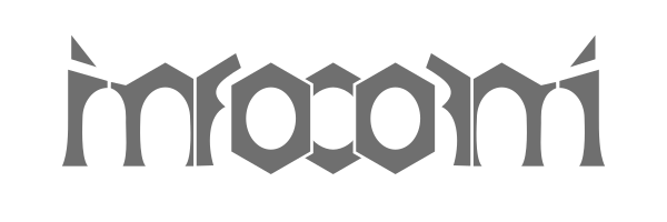
Well, I can't turn back time, but here's what I can offer you: an SVG (resolution-independent) rendering of the original logo. Weird gaps and all.
![]()
I left off the "TM" because the trademark expired a long time ago. (Pay no attention to those guys in Colorado Springs.)
...What, did you stick around through that whole post waiting for a moral? Sorry. I was tracing the Infocom logo for my own purposes and I noticed there were two versions out there. Then I found all those prototypes. (Mobygames has one of them but the others were new to me.) I figured it was all worth writing up.
While I was writing, I realized that the familiar logo should be called the "worm logo". To differentiate it from the "i" prototypes, I mean. Wouldn't you say it's in the late-70s spirit of the NASA worm?

Also, now that I look... that Mobygames page has a pixelized version of the logo:
![]()
It's clearly hand-drawn with love. I considered the idea that this was the original, and the print version followed, but that doesn't make sense. Nobody in 1980 would design for the screen first. Anyhow, this has differently weird spacing.
Comments from Mastodon
@zarfeblong Stuff like this makes me so happy to a degree I should probably worry about. 😂
@zarfeblong always loved this logo. it felt like a display of "turn of the 1980s powerful important technology corporation" aesthetics, with a subtle playfulness to it that came out on the game boxes where it was clear these products were works of imagination.
@zarfeblong cyberpunk has kind of run its course but if i'm ever forced make something in that milieu i promise to sneak an Infocom logo into the background, the way that Blade Runner mused that Atari might be one of the world's biggest companies in its version of 2019.

@zarfeblong the "what if Cornerstone had succeeded on par with Lotus 1-2-3" timeline
@jplebreton (I see I have to tweak my blog-comment script to fetch images.)
No need to apologize, Andrew. I really enjoyed that post.
5/5 Would read again, as they say.
@zarfeblong
Oh wow, that one logo emerging from a haze of horizontal lines is great. I hate it in such a delicious way, I can really see a cleaned up version of it muddily printed on a 5.25” floppy sleeve.
I swear I didn’t think about this until the post was done, but 1980 would also have been when Scott Kim was working on Inversions. Infocom might even have heard of him, as Godel Escher Bach had just burst onto the nerd scene.
Could they have rendered “INFOCOM” as an ambigram?
I am not particularly good at this, but here’s my attempt.
@zarfeblong interesting as always :)