Speaking of tablet editions...
Wednesday, May 18, 2011
Comments: 1 (latest July 12)
Tagged: ipad, hideous failure, adaptations, tabletop games, platforms

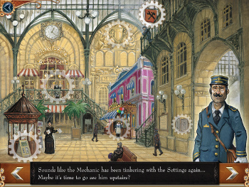
...I want to know who came up with this flaming disaster of a main menu. Confess. Right here. I'm talking to you. I want you to comment on this blog post and say "That was my idea."
This is the main menu from Days of Wonder's new Ticket to Ride iPad release. You can actually see the design bleeding to death in front of you. You start with some nice artwork. But you don't want to clutter it up with labels or buttons. Result: impossible to decide where to tap! Wound one.
So you had to add some "gear" icons (which aren't quite contrasty enough, but then if they were contrasty enough they'd detract from the artwork, right?) Now at least the player knows where the buttons are.
But she still doesn't know what any of the buttons do, so you had to add a voiceover to explain them. Wound two. The player has to sit through the entire list to learn the menu, and then probably has to sit through the list again every time she wants to use the menu in the future, because how are you going to remember all that? Oh, and the explanations can't be clear -- they have to be cutesey in-character clues.
But the UI still doesn't work, because the player might be hearing-impaired (or just have the sound switched off). So you had to add subtitles too. Wound three: bleed out. In order to avoid putting words on your menu, you've put entire sentences on your menu! But sentences that appear one at a time! It's perfect! And I'll have to listen to those stupid voiceovers forever.
Jesus Headpounding Migraine in a weasel-bucket. You've taken the worst idea of late-90s UI design -- the mystery-meat menu with cursor hover labels -- and port it to a platform that doesn't have cursor hovering, and you managed to make it worse. Kill me now.
(Ticket To Ride is fine once you get a game going. Nice solid implementation. I'd like a face-to-face play mode, even if it has to run with open hands. But it's worth buying as-is. Except the menu KILL ME NOW.)


I'm happy to note that an update to the TTR app was released this weekend, and the main menu now has text labels on its buttons. Thanks!
It also adds face-to-face play, which is awfully nice too. UI ranting aside. :)