

Sweet formatting for Inform 7 source code
Monday, February 23, 2015
Comments: 4 (latest March 5)
Tagged: inform 7, interactive fiction, printed artifacts, syntax coloring, if
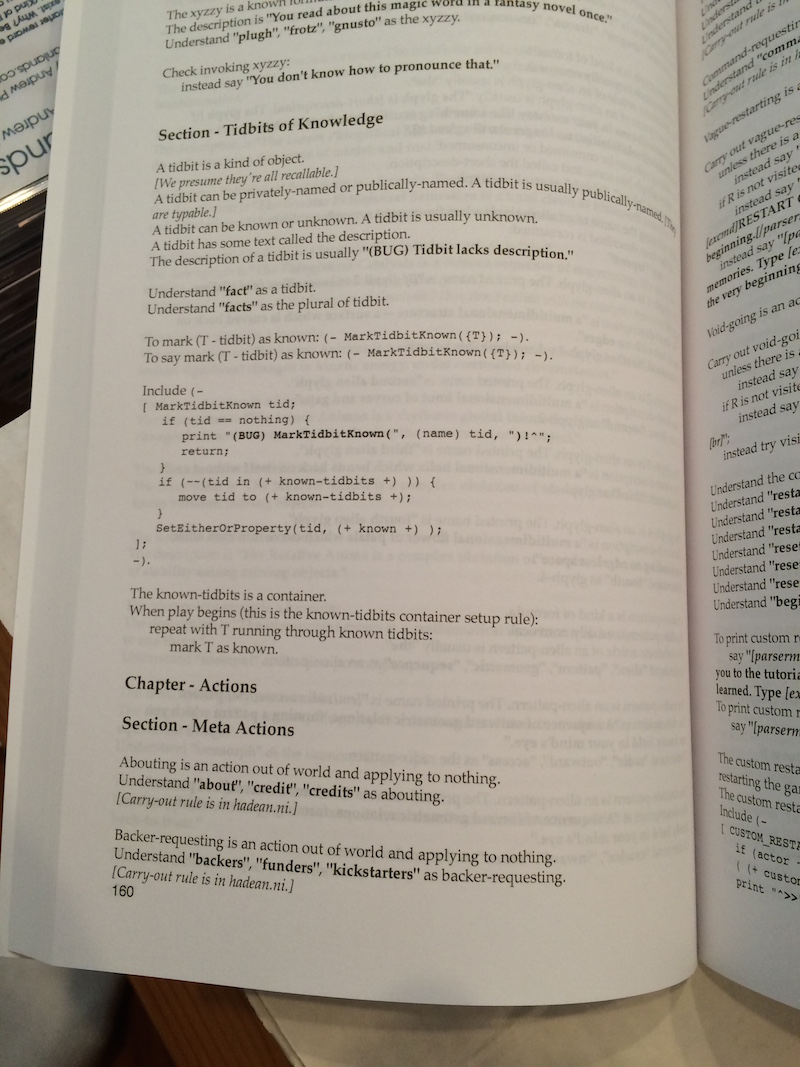
One of my limited, high-level Kickstarter rewards was "The Hadean Lands source code, in book form". I had these printed in January, I mailed them out last week, and some of my backers have already received them. They're a hit!
@zarfeblong Hadean Lands source book looks fantastic. If I7 source is readable in book form, this is about as good as I'd expect it to look. (-- @dan_sanderson)
My Hadean Lands Source Codex book arrived. Wow - really nicely done. I'm in love with this strange artifact. Thanks @zarfeblong! (-- @telehack)
@zarfeblong Book received, really nice! What service did you use? Did I7 output source that nice-looking or did you post-process a lot? (-- @dan_schmidt)
That last is an excellent question. Everybody deserves nicely-printed source code, so here's how I did it.
(Spoiler: here's my Python script.)
Inform 7 syntax-coloring is a solved problem... sort of. The I7 IDE does it, right? Syntax-coloring plugins have been contributed for several editors and tools. But, of course, none of them were exactly what I wanted. So I had to grab a shovel and start digging.
(Maybe I should avoid that metaphor, given the past month of Boston weather. Hm.)
The most prominent syntax-coloring tool that I'm aware of is Pygments. GitHub uses it. Pygments picked up Inform (6 and 7) support in release 2.0, which is why you can visit a GitHub page like this Kerkerkruip test extension and see nicely-colored source code.
...well, sort of nice. There are some obvious problems here. The latest version of Pygments does a better job (I guess GitHub is using a pre-release version?) but it's still not ideal.
For I7, I want just a few text styles:
- Ordinary code
- Comments -- italics
- Strings -- boldface
- Interpolations (square brackets) inside strings -- bold-italics
- Headers -- large font
- Inform 6 inclusions -- fixed-width font
It's a little trickier because I6 inclusions can themselves contain comments and strings, so you also need fixed-italics and fixed-bold. That's still just eight styles total.
(Yes, you can further color I6 inclusions into seventeen styles based on the details of I6 syntax, but that's a terrible idea.) (I did toy with distinguishing I6 dictionary words from I6 strings, which is important for I6 programming, but I decided not to.)
Marking up I7 code this way is only moderately fiddly. (Fiddliest detail: I7 comments can be nested!) I've already written a BBEdit plugin that does it, so I just had to port the algorithm to Python and build a Pygments lexer class.
Problem solved... sort of. See, I decided to use Pygments's RTF formatter -- I wanted to generate RTF and then import it into AppleWorks. (I mean ClarisWorks. I mean iWorks. Oh, never mind--) What I found was that Pygments's RTF assumes a text-editor-like display -- all the same font, all the same font size. I had to hack around and repurpose some style attributes to get the effect I wanted.
Of course RTF is a terrible, stupid legacy format, but the Pygments people have done the hard work of figuring it out.
So, problem now solved? Well...
Here's the script I built to do the job: i7tortf.py. It contains my custom I7 parser, my custom RTF generator, my custom stylesheet, and some code to read in a bunch of files and glue them together. (HL comes as a set of nine files -- a master and eight extensions. I7 prefers one giant file, but I can't work that way.)
The script can generate colorful RTF, or plain black with only the font variations to distinguish styles. Obviously, for the book, I went monochrome.
Loading this into PagesWhatever went smoothly -- praise the little hobgoblins of consistency. However, I still had to do some hand-tuning. I added page breaks between each files. I also marked the title line of each file with a custom style, so that Pages would generate a table of contents for me. I added all the necessary fore-matter -- title page, copyright page, introduction. And then I spent a while tweaking margins and tab stops and font sizes so that the thing wasn't quite so much of a brick.
Generate a PDF, package it up, send it off to Lulu.com. Whoops, nearly forgot the cover art... And then wait for the proof copies to arrive.
The proof copies arrived, and -- wow, they were bricks. Just because A4 paper size is a valid Lulu print option doesn't mean you want to ship thirty of them across the country. Or lift one of them, for that matter.
Also, there was an extra blank page after the title page. Yes that matters! My copyright page was on the right-hand side! All my page numbers were in the gutter!
I guess it goes to show that PDF is also a terrible, stupid legacy format. I verified with customer support that they had the same PDF I sent, and it didn't appear to have an extra blank page when they looked at it, but when it came out of their printer... oh well.
I had to reformat anyway, because A4 was hopeless. I knocked down the font size and the page size. (I settled on comic-book trim, 6.6"x10.25".) I messed with the margins some more. Magically, when I sent in the new PDF, the extra-page error went away. I'll never know why.
That's the story. Now I have Hadean Lands books. Twenty-nine lucky backers soon will too.
Comments imported from Gameshelf
Andrew Plotkin
(February 25, 2015 at 11:27 PM):
I might do a general-release edition of the book someday. I'm not planning to just post the source code on my web site.
Aaron Reed
(March 5, 2015 at 10:41 AM):
Yes please! :)
Andrew Plotkin
(March 5, 2015 at 3:39 PM):
So, do you think this would be worth self-publishing? Or is there an academic publisher who is interested in this sort of thing?
I don't want to put it up on the basis of "Eh, it's easy, might as well see what happens." (For one thing, it wouldn't be easy. I'd want to add commentary and talk about the program structure some.)
Are you planning to publish the source code outside of the book? Would love to cheat and look some stuff up :).